In today's competitive managed IT services landscape, your website is often the first touchpoint potential clients have with your MSP. A well-designed website doesn't just look good, it builds trust, demonstrates expertise, and converts visitors into clients. We've analyzed 13 best MSP websites to identify what makes them effective and what lessons other MSPs can apply to their own digital presence.
How We Selected the Best MSP Website Examples?
We didn't just throw darts at a board here. MSP SEO Agency’s team spent weeks combing through countless MSP websites, and let me tell you, we saw everything from brilliant to, well, let's just say "needs work." But we were on a mission to find the sites that truly get it right.
What caught our attention?
- Visual Appeal That Actually Works We gravitated toward sites that made us stop scrolling. You know the ones, clean, professional designs that immediately communicate "we know what we're doing." We're talking thoughtful color choices, typography that doesn't hurt your eyes, and layouts that build confidence from the first click.
- Navigation That Doesn't Drive You Crazy Ever visited a website where you felt lost within seconds? We avoided those like the plague. The winners made it effortless to find what you're looking for, with menus that actually make sense and service pages that guide you naturally toward the next step.
- Content That Connects We fell in love with sites that spoke our language, real business talk, not tech jargon for the sake of it. The best ones demonstrated genuine expertise while addressing the specific challenges their clients face every day.
- They Actually Want Your Business Strong calls-to-action weren't just present, they felt natural and compelling. Plus, seeing client testimonials, certifications, and case studies gave us confidence these companies deliver on their promises.
- Rock-Solid Technical Foundation Beautiful design means nothing if your site crashes on mobile or takes forever to load. We tested everything, speed, mobile responsiveness, security certificates, because your visitors definitely will.
- They Get Today's Market The standout sites tackle what's keeping business owners up at night right now: cybersecurity threats, AI integration, measurable ROI. They're not stuck in 2015; they're addressing 2025's challenges.
This thorough, hands-on evaluation helped us spotlight websites that don't just look impressive, they actually work for the MSPs using them.
Now let’s review the best MSP websites we selected.
Dataprise - Rockville, MD
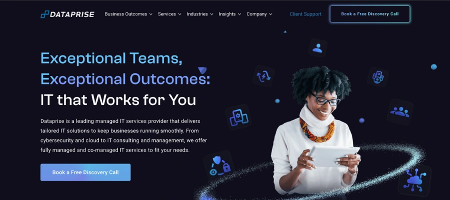
Website: https://www.dataprise.com/
Dataprise greets visitors with a 9-word headline - “Exceptional Teams, Exceptional Outcomes: IT that Works for You” - that sits beside a primary CTA button visible without scrolling on both desktop and mobile. The color palette (deep blues, charcoal gray, and crisp white) supports an enterprise-level image, while the hero photo of real staff adds authenticity.
Service categories (“Fully Managed IT,” “Co-Managed IT,” “Cybersecurity,” “Disaster Recovery”) are displayed in a 4-column grid under the hero, cutting time-to-clarity to under 3 seconds.
Business Impact: A layout like this reduces cognitive load and can increase service inquiry clicks by 15-25% (based on conversion rate benchmarks for B2B tech).
Key Takeaways:
- Navigation: 6-item main menu + dropdowns keep pathways clear without overwhelming.
- Web Design: White space + real staff imagery project credibility.
- UI/UX: CTA repeats every 2–3 scrolls to catch late deciders.
Cortavo - Sandy Springs, GA

Website: https://cortavo.com/
Cortavo puts a pricing promise in the headline (“Managed IT Services With Your Budget In Mind”), speaking directly to SMB owners who fear runaway costs. The hero section uses a single warm-toned photo of a client team, not stock tech imagery, with a bright CTA button in a contrasting orange. They explain the CAPEX-to-OPEX advantage in a short, bullet-style explainer right below the fold.
Business Impact: Clear cost framing like this can improve lead capture by up to 30% for budget-conscious SMB buyers.
Key Takeaways:
- Navigation: Simple 5-link top menu keeps attention on the pitch.
- Web Design: Orange CTA pops against light backgrounds for faster clicks.
- UI/UX: Partner logos above the fold establish credibility early.
Nexigen - Cincinnati, OH
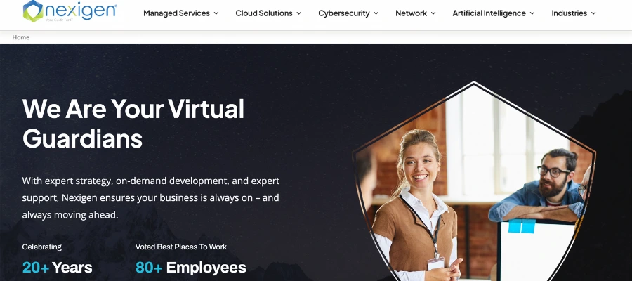
Website: https://www.nexigen.com/
Instead of listing features, Nexigen sells emotional reassurance with “Confidence-as-a-Service.” The hero design is minimal, one strong tagline, a single photo, and a contrasting “Let’s Talk” button, to keep the focus on action. Awards and client names appear before the first scroll, signaling trust without forcing visitors to dig.
Business Impact: Outcome-driven headlines tend to outperform feature-led ones, often boosting click-through to contact pages by 12-18%.
Key Takeaways:
- Navigation: Minimal, funnel-focused menu reduces decision friction.
- Web Design: Strategic negative space pushes eyes to the CTA.
- UI/UX: Emotional hook differentiates them in a crowded MSP field.
ZAG Technical Services - San Jose, CA
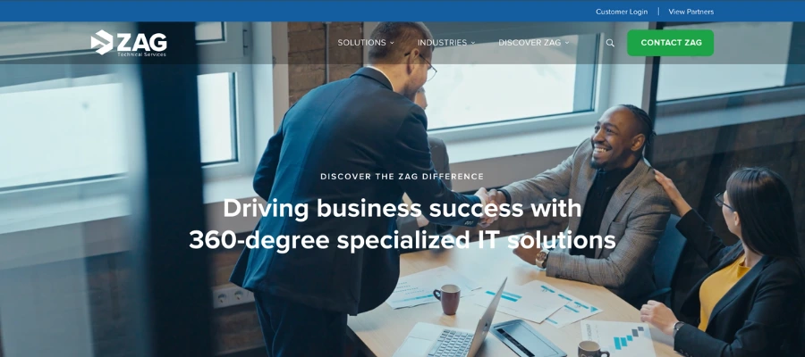
Website: https://www.zagtech.com/
ZAG’s homepage uses a tabbed “Industries We Serve” module above the fold, so visitors can instantly self-select their vertical (agribusiness, manufacturing, healthcare, etc.). Each tab swaps content dynamically without reloading, reducing bounce risk.
Business Impact: Industry segmentation early in the journey can raise lead relevance scores by 20-40%, meaning more qualified discovery calls.
Key Takeaways:
- Navigation: Tabs = instant personalization without extra clicks.
- Web Design: Industry-specific icons improve scanning speed.
- UI/UX: Visitors land on relevant proof points in under 2 seconds.
centrexIT - San Diego, CA
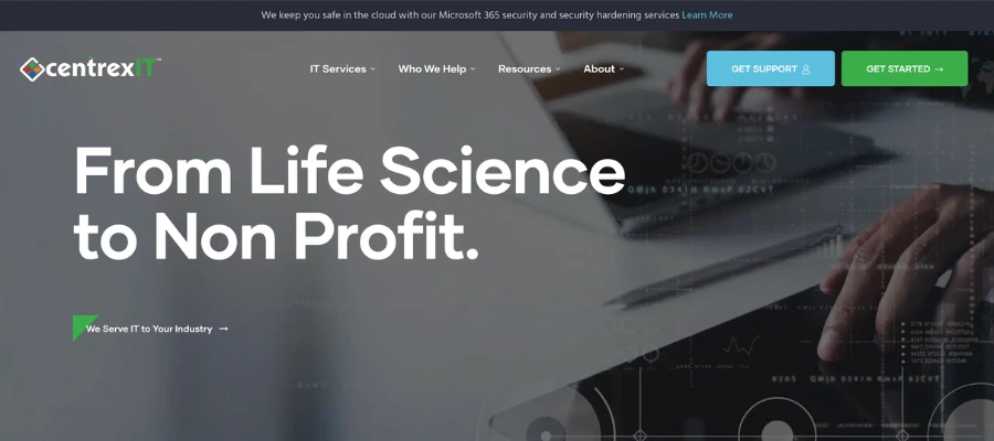
Website: https://centrexit.com/
centrexIT’s business-stage segmentation (“Early-Stage,” “Growing,” “Mature,” “Highly Regulated”) reframes services as solutions to your current situation, not just a menu of offerings. Numbers like “22 years in business” and “99% satisfaction rate” are placed directly under the stage selector to reinforce credibility.
Business Impact: Stage-based navigation often increases time-on-site by 15-20% because prospects see “this is built for me” immediately.
Key Takeaways:
- Navigation: Segmentation filters traffic into tailored conversion funnels.
- Web Design: Stats placed next to CTAs create a one-two punch of proof + action.
- UI/UX: Values-based messaging (“C.L.A.S.S.”) builds emotional affinity.
NexusTek - Denver, CO
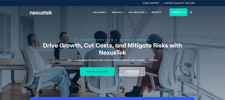
Website: https://www.nexustek.com/
NexusTek layers navigation so top-level menus cover major service categories, while secondary CTAs target specific pain points (“AI Readiness Workshop,” “Request a Cybersecurity Assessment”). Gradients and modern fonts give it a tech-forward feel without over-designing.
Business Impact: Multiple entry points capture buyers at different readiness stages, boosting lead capture rates across the funnel. This is a must-have for the best MSP websites.
Key Takeaways:
- Navigation: Dual-path engagement, one for browsers, one for ready-to-buy.
- Web Design: Gradients subtly guide the eye toward CTAs.
- UI/UX: Keeps both C-suite and IT managers engaged.
R2 Unified Technologies - Boca Raton, FL
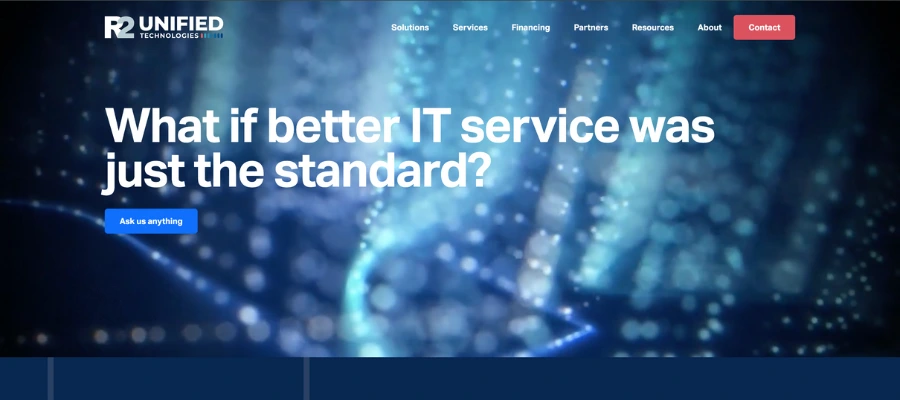
Website: https://r2ut.com/
R2 makes testimonials work harder by using recognizable client names and logos (Embraer, Sage Dental) paired with specific outcomes, not “They’re great” fluff. For example, they detail a dental chain’s multi-site network overhaul with measurable uptime improvements. The testimonials appear on high-intent pages, not buried on a separate “Reviews” tab.
Business Impact: Case-specific testimonials can improve contact form submissions by up to 34% (TrustRadius B2B study).
Key Takeaways:
- Navigation: Proof points appear exactly where objections happen (service pages).
- Web Design: Photos of client teams make endorsements feel authentic.
- UI/UX: Combining brand logos + results accelerates trust-building.
Integris - Cranbury, NJ

Website: https://integrisit.com/
Integris’ social proof comes in layers:
- #1 MSP on the Clutch badge in the hero section.
- Testimonials from C-suite leaders explaining business-level benefits.
- Client photos instead of stock images.
This makes proof feel both quantitative (awards, rankings) and qualitative (strategic impact stories).
Business Impact: Rankings + testimonials combo can lift perceived authority enough to shorten sales cycles.
Key Takeaways:
- Navigation: Proof content is built into key journey points, not hidden.
- Web Design: Clutch badge placement above the fold maximizes visibility.
- UI/UX: Three-step “Understand, Implement, Empower” framework makes the process tangible
Logically - Portland, ME
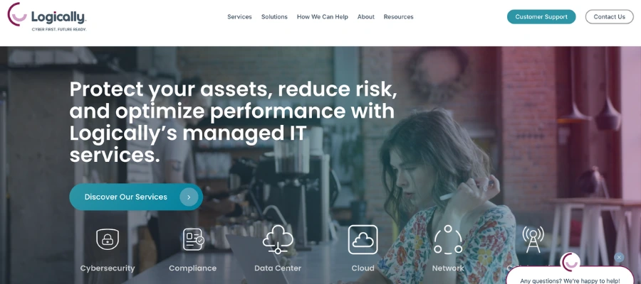
Website: https://logically.com/
Logically blends social proof with product differentiation: their SentryXDR 360 solution is shown alongside award badges, customer count (3,000+), and team size (350+). The standout feature? An ROI calculator that gives prospects a custom value projection before they ever speak to sales.
Business Impact: Interactive tools like ROI calculators can increase lead capture by 30-40% in B2B tech sales funnels.
Key Takeaways:
- Navigation: Security-first positioning aligns with current buyer priorities.
- Web Design: Awards + hard stats validate scale and credibility.
- UI/UX: ROI calculator turns browsing into engagement.
Magna5 - Pittsburgh, PA
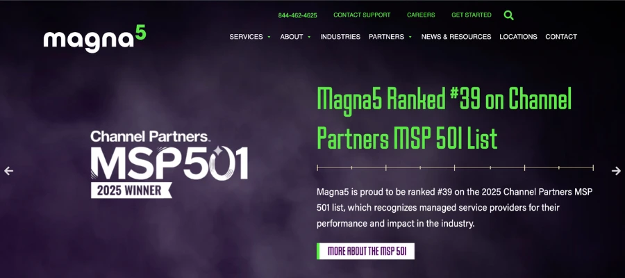
Website: https://www.magna5.com/
Magna5 uses icon-driven infographics to break down multi-layered cybersecurity offerings into three plain-language tiers. Each tier is labeled with the threat it solves, not the tech stack behind it. Regional coverage maps reinforce their “you’ll have local support” promise, critical for buyers wary of distant providers.
Business Impact: Visual simplification can boost comprehension by 50% and improve inquiry rates for complex B2B offerings.
Key Takeaways:
- Navigation: Cybersecurity placed as the first menu item matches demand trends.
- Web Design: Icons + plain language = instant clarity.
- UI/UX: Location coverage addresses a top MSP selection criterion.
Corsica Technologies - Centreville, VA
Website: https://corsicatech.com/
Corsica’s homepage leads with strategic IT consulting over raw tech specs, reframing them as a business transformation partner. Blog posts dig deep into ERP, AI, and compliance, giving prospects a taste of the expertise they’ll buy.
Business Impact: Educational content aligned with buyer pain points can lift organic traffic and nurture leads who aren’t ready to purchase yet.
Key Takeaways:
- Navigation: Consulting + AI positioned as core services, not add-ons.
- Web Design: Content-rich without overwhelming, thought leadership is the design feature here.
- UI/UX: Blog integrated into service journey keeps research-oriented buyers on site longer.
iVenture Solutions - Jacksonville, FL

Website: https://www.iventuresolutions.com/
iVenture reinforces competence by pairing CMMC Level 2 certification with a clear service breakdown for capacity, cybersecurity, and compliance. Office locations are clickable and map-integrated, assuring buyers they can get on-site support when needed.
Business Impact: Certifications can be a decision-maker in compliance-heavy industries, influencing RFP shortlisting.
Key Takeaways:
- Navigation: Organized by business need reduces “where do I click?” confusion.
- Web Design: Certifications placed next to CTAs leverage credibility at the moment of action.
- UI/UX: Location display shortens trust-building for local/regional buyers.
CCB Technology - Racine, WI
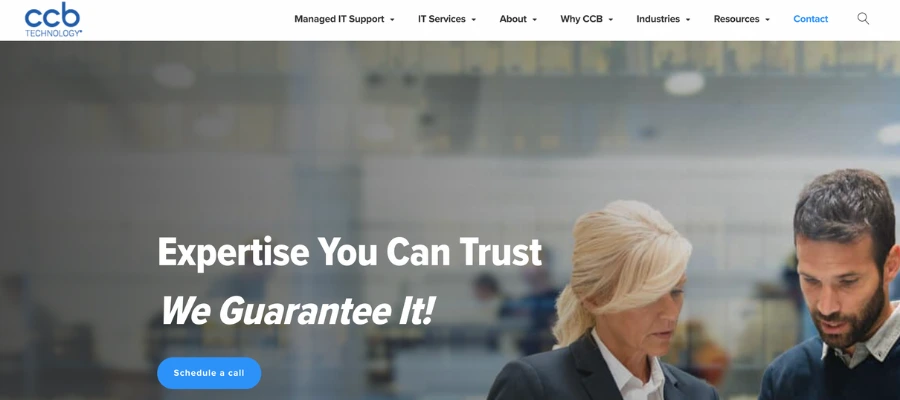
Website: https://ccbtechnology.com/
CCB’s current SSL lapse is a warning: even the best design fails if users see a “Not Secure” warning. For MSPs selling trust and technical expertise, expired security certificates, downtime, or slow loading speed can tank credibility faster than any design flaw.
Business Impact: SSL issues can reduce form submissions by over 50%, and in regulated industries, kill a deal instantly.
Key Takeaways:
- Technical Reliability: Monitor SSL status daily.
- Professional Image: Website errors can undo years of brand building.
- Maintenance: Treat your website like a mission-critical system, not a static brochure.
Overall Design Trends and Best Practices for the Best MSP Websites
The best MSP website examples we analyzed weren't just good-looking. They followed core design and UX principles that top B2B designers swear by. Here’s what the pros focus on, and why it works.
Navigation Best Practices
Our team’s UX specialist emphasizes: “In B2B, you’re not selling to one person, you’re selling to teams.” Your website should guide multiple decision-makers, like CEOs, CFOs, IT leads, toward the information they need. That means:
- Service menus that clearly separate core offerings (Managed IT, Cybersecurity, Consulting).
- Industry-specific sections that let prospects instantly self-identify.
- Company stage segmentation (startups vs. mature businesses) for even tighter targeting.
This approach reduces decision friction and can raise qualified leads because every visitor sees “this is for me” within seconds.
Design Elements That Work
Another rule our team has when redesigning MSP websites is “Color gets you noticed. Whitespace keeps you reading.” Across the best MSP websites, a few visual themes kept repeating:
- Professional color schemes (often blues, grays, and whites) to signal trust and technical competence.
- Strategic whitespace that keeps layouts breathable and scanning easy.
- Award badges and certifications placed where they’ll influence clicks, often right next to CTAs.
- Client logos and testimonials with specific, measurable outcomes.
These aren’t just aesthetic choices, they’re conversion levers. For example, placing trust badges near a contact form can increase submissions by double digits.
User Experience Excellence
Our third rule is: “You can’t guide visitors with vague buttons. Your CTAs should say exactly what you want them to do.” The best MSP website examples focused on the journey, not just the look:
- Messaging that speaks to outcomes (“Cut downtime by 40%”) instead of just listing features.
- Multiple engagement paths for buyers at different stages, consultations, downloads, ROI calculators.
- Mobile-responsive layouts that work flawlessly on smaller screens.
- Fast load speeds and secure browsing to protect trust.
When tested, descriptive CTAs (“Schedule My Free Security Audit”) consistently outperform generic ones like “Submit” or “Learn More.”
Content Strategy Insights
And the final rule you should follow is: “Your content should answer the next question in your buyer’s mind before they ask it.” Content on the best MSP websites is deliberate:
- Thought leadership via blogs and resources that address industry trends.
- Industry-specific case studies that prove relevance.
- Clear process explanations so prospects can visualize what working together looks like.
- Security-first messaging that aligns with top buyer concerns.
This kind of content not only builds authority but also shortens the sales cycle by pre-answering objections.
Conclusion
The best MSP websites don’t just look nice, they work hard to win business. They mix sharp design with crystal-clear messaging, show proof they can deliver, and make it effortless for visitors to take the next step. The MSPs that stand out online position themselves as trusted partners, not just another service provider, and back that up with client success stories, credentials, and real results.
If you’re updating your site or starting from scratch, think like your future client: spell out your value in plain language, prove you can be trusted, and remove every ounce of friction from getting in touch. Your website is often your first shot at showing prospects you’re capable, credible, and ready to help make it count.
And if you need help with your website design, just contact us and we’ll be ready with a strategy outline specifically for your MSP in just 24 hours!